Facade design Edeka Scheck-In Center
Frankfurt am Main, 2008
Commercial buildings Architecture: Müller+Huber, Oberkirch
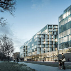
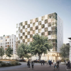
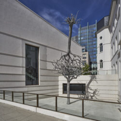
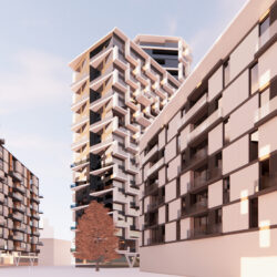
The facade design for the Edeka supermarket on Hanauer Landstraße was inspired by the streets’ original character, making references to the areas industrial past, and its situation near Frankfurt’s eastharbour. Annular kiln clinker (a heavy and resistant traditional type of brick) was the material of choice, not only due to its high quality appearance and vivid colouring but also thanks to its longevity. This facade convincingly combines tradition with a dash of urban pulse.
schneider+schumacher were responsible for the facade design and implementation. The overall project was executed by Architekturbüro Müller + Huber, Oberkirch.
Technical details:
Typology: Commercial buildingsProcurement documentation: Direct
Service phases (HOAI): 1-2


